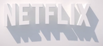
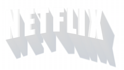
The following is a guest post by Gregor Adams about how he managed to re-create the Netflix logo in CSS. Gregor is kind of the rising star when it comes to CSS, so needless to say it is a great honor to have him here.
A few months ago I tested Netflix, immediately got hooked and got myself an account. I started watching a lot of series that I usually had to view elsewhere. Each episode or movie starts with the Netflix logo animation.

I immediately started thinking about implementing this in CSS. So after watching a few episodes I went over to CodePen and started to work on the logo.
First concept
My first implementation was a little dirty since I was trying a few things.
For example: I wanted to do this in pure CSS and I also wanted to be able to run the animation again when I click a button, so I had to use some magic. Luckily I always have a few tricks up my sleeve when it comes to CSS.
But let’s talk about the actual animation.
I recorded the logo and looped it in Quicktime so I could examine it in detail. I tend to do that a lot because it allows me to stop at certain frames to figure out what is actually going on.
The logo:
- starts with a white screen;
- pops out as white 3d letters;
- throws a shadow;
- fades back;
- changes the font color to red.
So these were the animation steps I needed to replicate. But there is something else about the logo that I needed to take care of: the letters are tilted to the center of the logo.
People have been asking me how I did that… I do a lot of 3d experiments, so this wasn’t that much of a difficulty to me.
Deforming/Tilting the letters
I started with some basic markup for the word “Netflix”
<div class="logo">
  <span>N</span>
  <span>E</span>
  <span>T</span>
  <span>F</span>
  <span>L</span>
  <span>I</span>
  <span>X</span>
</logo>
I made a wrapper with the class logo and wrapped each letter in a span.
Then I rotated the letters on the y-axis and scaled them on the x-axis to retain its original width. The important part is setting a perspective on the wrapper and defining its perspective-origin.
// Basic letter styling
span {
  font-size: 8em;
  font-family: impact;
  display: block;
}

// Enable a 3d space
.logo {
  perspective: 1000px;
  perspective-origin: 50% 0;
}

// Transform the letter
.logo span {
  transform-origin: 0 0;
  transform: scaleX(80) rotateY(89.5deg);
}
There are different way of doing this, like using a different perspective (e.g. 500px), rotation-angle (e.g. 9deg) and scale value (e.g. 0.5) but these values turned out to work the best for my needs.
Here’s a demo on CodePen:
See the Pen netflix logo | (figure--1) by Gregor Adams (@pixelass) on CodePen.
Next I had to apply this to all the letters respecting that the middle letter is not transformed, the ones to the right are tilted in the opposite direction and the height of the letters changes.
To do this I needed to add some logic: I use Sass with the SCSS syntax to do this.
.logo {
  perspective: 1000px;
  perspective-origin: 50% 0;
  font-size: 8em;
  display: inline-flex;

  span {
    font-family: impact;
    display: block;

    $letters: 7;
    @for $i from 1 through $letters {
      $offset: $i - ceil($letters / 2);
      $trans: if($offset > 0, -89.5deg, 89.5deg);

      &:nth-child(#{$i}) {
        // trans/de-form the letters
        transform-origin: 50% + 50%/$offset 200%;
        font-size: if($offset == 0, 0.85em, 0.9em + 0.015*pow(abs($offset), 2));
        transform: if(
            $offset == 0,
            scale(1, 1),
            scale(95.9 - abs($offset) * 10, 1)
          ) if($offset == 0, translatey(0%), rotatey($trans));
      }
    }
  }
}
Here’s a demo on CodePen
See the Pen netflix logo (figure--2) by Gregor Adams (@pixelass) on CodePen.
A function for the shadow
Let’s write a function for the 3d-effect and the shadow. I paused on one frame of the video I had made before and looked at it in detail.

As you can see the 3d effect’s vanishing point is in the center while the shadow drops to the bottom right. Now we know what our function has to be able to do.
We will call this function inside keyframes so we want it to be able to handle a few values like:
- color
- x
- y
- blur
- mix
We need one more argument to define the depth of the shadow or 3d-effect.

Here’s the function I am using to handle all these requirements:
/// Create a 3d-shadow in a certain direction
/// @author Gregor Adams
/// @param  {Number}        $depth - length of the shadow
/// @param  {Unit}          $color - color of the shadow
/// @param  {Unit}          $x     - step to next shadow on the x axis
/// @param  {Unit}          $y     - step to next shadow on the y axis
/// @param  {Unit}          $blur  - blur of the shadow
/// @param  {Color|false}   $mix   - optionally add a color to mix in
/// @return {List}          - returns a text-shadow
@function d3($depth, $color, $x: 1px, $y: 1px, $blur: 0, $mix: false) {
  $shadow: ();

  @for $i from 1 through $depth {
    // append to the existing shadow
    @if type-of($mix) != 'color' {
      $shadow: append(
        $shadow,
        round($i * $x) round($i * $y) $blur $color,
        comma
      );
    } @else {
      $shadow: append(
        $shadow,
        round($i * $x) round($i * $y) $blur mix($mix, $color, 0.3%*$i),
        comma
      );
    }
  }

  @return $shadow;
}
This function might be a little hard to understand for Sass-noobs or developers/designers that only use the basic features of the language, so let me explain it in detail.
I start off with a variable I called $shadow. It is an empty list.
$shadow: ();I am looping from 1 through the depth. through in Sass means that we iterate including this value.
from 0 to 5 = 0, 1, 2, 3, 4from 0 through 5 = 0, 1, 2, 3, 4, 5
In each iteration I append a text-shadow to the list. So in the end the variable looks something like this:
$shadow: (
  0 1px 0 red,
  1px 2px 0 red,
  2px 3px 0 red,
  …
);
… and I use it like this:
text-shadow: d3(5, red, [$x], [$y], [$blur], [$mix]);$x, $y, $blur and $mix are optional arguments. I already mentioned that I will call this function inside keyframes so I need to be able to optionally change them. $mix will allow to add a second color so the shadow fades from one to the other.
Here’s a demo on CodePen:
See the Pen netflix logo (figure--3) by Gregor Adams (@pixelass) on CodePen.
Putting it all together
Since I have created all the parts I need, I can now create the animation.
Popping out (animation-intro)
I am using two variables $offset and $trans which I have already defined above. The animation has 3 stages, so I can carefully decide when it reaches a certain point.
@keyframes pop-out {
  0% {
    transform: if($offset == 0, scale(1, 1), scale(95.9 - abs($offset) * 10, 1))
      if($offset == 0, translatey(0%), rotatey($trans));
    text-shadow: d3(15, rgba($c_3d, 0), 0, 0), d3(50, rgba($c_shadow, 0), 0, 0);
  }

  50% {
    transform: if(
        $offset == 0,
        scale(1.2, 1.2),
        scale(126.2 - abs($offset) * 10, 1.2)
      ) if($offset == 0, translatey(-16%), rotatey($trans));
    text-shadow: d3(15, $c_3d, if($offset == 0, 0, -0.25px * $offset), 1px), d3(50, $c_shadow, 1px, 3px, 3px, $c_shadow-mix);
  }

  100% {
    transform: if(
        $offset == 0,
        scale(1.1, 1.1),
        scale(116.2 - abs($offset) * 10, 1.1)
      ) if($offset == 0, translatey(-12%), rotatey($trans));
    text-shadow: d3(15, $c_3d, if($offset == 0, 0, -0.25px * $offset), 1px), d3(50, $c_shadow, 1px, 3px, 3px, $c_shadow-mix);
  }
}
Fading back (animation-outro)
Now let’s do the same thing for fading back.
@keyframes fade-back {
  0% {
    transform: if(
        $offset == 0,
        scale(1.1, 1.1),
        scale(116.2 - abs($offset) * 10, 1.1)
      ) if($offset == 0, translatey(-12%), rotatey($trans));
    text-shadow: d3(15, $c_3d, if($offset == 0, 0, -0.25px * $offset), 1px), d3(50, $c_shadow, 1px, 3px, 3px, $c_shadow-mix);
  }

  20% {
    transform: if(
        $offset == 0,
        scale(1.05, 1.05),
        scale(105.9 - abs($offset) * 10, 1.05)
      ) if($offset == 0, translatey(-7%), rotatey($trans));
    text-shadow: d3(15, rgba($c_3d, 0), 0, 0), d3(50, rgba($c_shadow, 0), 0, 0);
  }

  100% {
    transform: if($offset == 0, scale(1, 1), scale(95.9 - abs($offset) * 10, 1))
      if($offset == 0, translatey(0%), rotatey($trans));
    text-shadow: d3(15, rgba($c_3d, 0), 0, 0), d3(50, rgba($c_shadow, 0), 0, 0);
  }
}
Change color
I also needed to provide an animation to change the color.
@keyframes change-color {
  0% {
    color: $c_bg;
  }
  100% {
    color: $c_fg;
  }
}
Calling the animations
Now we can chain these animations like so:
animation-name: pop-out, fade-back, change-color;
animation-duration: 4s, 2s, 0.1s;
animation-delay: 0s, 2s, 3.2s;
The code above is just an approximate example. Each letter has a different delay and duration. You can see the final implementation here Netflix animation in pure CSS
Final notice: I added some magic to retrigger the animation in pure CSS but that’s something I might explain in another article.
I am never really happy with my experiments and while writing this article I found several ways how I could improve the code and effect.
I rewrote the entire Sass code prior to writing this article but I still feel that I can improve some parts. That is the main reason why I never stop making experiments. It just makes me smarter and bends my thoughts in directions I never knew existed.
I barely make use of techniques like these in real-life projects but I very often use the functions I needed to implement that effect. Anyway, I hope you enjoyed this article.